

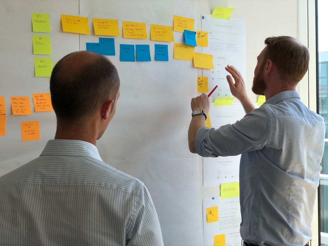
Building a scalable design system is no longer a luxury for growing digital teams. As products expand across platforms, markets, and user segments, inconsistent design decisions become expensive, slow, and risky. A strong design system creates a shared foundation for product teams, helping organizations deliver cohesive experiences while reducing duplicated work.
TLDR: The most effective solutions for building scalable design systems combine clear governance, reusable components, strong documentation, and close collaboration between design and engineering. Tools matter, but process and ownership matter more. A scalable system should evolve with the product, support accessibility from the start, and be measured by adoption, quality, and delivery speed.
Contents
- 1 1. Establish a Clear Design System Strategy
- 2 2. Build with Design Tokens from the Start
- 3 3. Create a Robust Component Library
- 4 4. Invest in Documentation That People Actually Use
- 5 5. Define Governance and Ownership
- 6 6. Make Accessibility a Core Requirement
- 7 7. Connect Design and Engineering Workflows
- 8 8. Measure Adoption and Improve Continuously
- 9 Conclusion
1. Establish a Clear Design System Strategy
Before selecting tools or building components, teams need a clear strategy. A scalable design system should answer practical questions: Who is it for? What problems does it solve? How will it be maintained? How will success be measured?
Without strategy, design systems often become visual libraries that look useful but fail to influence real product work. A serious approach starts with defining the scope: whether the system supports one product, a collection of products, or an entire enterprise ecosystem.
Strong strategy typically includes:
- Business goals: faster delivery, improved consistency, reduced rework, better accessibility, or easier product expansion.
- Audience definition: designers, developers, product managers, content teams, and quality assurance specialists.
- Operating model: centralized, federated, or hybrid ownership.
- Success metrics: component adoption, reduced design debt, faster implementation, fewer inconsistencies, and improved usability.
A design system is a product in itself. Treating it that way helps teams build with purpose instead of merely collecting interface patterns.
2. Build with Design Tokens from the Start
Design tokens are one of the most important foundations for scalability. They store design decisions such as color, typography, spacing, shadows, border radius, and motion values in a structured format that can be used across design and code.
Instead of manually updating the same color or spacing value across dozens of products, teams can change a token once and distribute that update consistently. This approach is especially valuable for organizations managing multiple brands, themes, platforms, or accessibility modes.
Examples of useful token categories include:
- Color tokens: primary, secondary, background, text, border, success, warning, and error values.
- Typography tokens: font families, sizes, line heights, weights, and letter spacing.
- Spacing tokens: consistent layout and component spacing values.
- Semantic tokens: values tied to meaning, such as button background primary or text danger.
For scalable systems, semantic tokens are particularly important. They allow design decisions to remain flexible even when visual themes change. This reduces technical friction and supports long-term maintainability.
3. Create a Robust Component Library
A scalable design system depends on a reliable component library. Components such as buttons, inputs, modals, navigation bars, cards, tables, and alerts should be designed and coded for reuse. The goal is not simply visual consistency; it is to create stable building blocks that reduce repeated design and engineering effort.
Good components are flexible but not chaotic. They provide enough variation to meet product needs while preventing unnecessary customization. For example, a button component may support several sizes, states, icons, and variants, but it should not allow uncontrolled styling that breaks consistency.
Each component should include:
- Usage guidance: when to use it and when not to use it.
- States: default, hover, focus, active, disabled, loading, and error where relevant.
- Accessibility requirements: keyboard behavior, ARIA guidance, color contrast, and screen reader expectations.
- Implementation notes: props, variants, dependencies, and constraints.
- Examples: practical product scenarios, not just isolated samples.
The strongest component libraries are shared between design and engineering. A component should not exist only in a design file if it cannot be implemented efficiently. Likewise, code components should reflect approved design standards.
4. Invest in Documentation That People Actually Use
Documentation is often the difference between a design system that scales and one that quietly fails. Teams need clear, searchable, and practical guidance. Documentation should not be treated as an afterthought created only after components are finished.
Effective documentation explains both how to use the system and why decisions were made. This helps teams make better choices when they encounter new or ambiguous product requirements.
Useful documentation includes:
- Foundations: color, typography, spacing, layout, iconography, motion, and content principles.
- Component guidelines: anatomy, behavior, variants, accessibility, and examples.
- Contribution process: how teams can request changes or propose new components.
- Release notes: updates, deprecated patterns, migration instructions, and breaking changes.
Documentation must stay current. Outdated guidance erodes trust quickly. Assign ownership, review it regularly, and connect documentation updates to component releases.
5. Define Governance and Ownership
Scalability requires clear governance. Without it, design systems become fragmented as teams create workarounds and duplicate components. Governance does not mean rigid control over every decision. It means providing a reliable process for maintaining quality while allowing the system to evolve.
There are three common governance models:
- Centralized: a dedicated team owns the system. This supports consistency but can create bottlenecks.
- Federated: multiple product teams contribute. This scales input but requires strong standards.
- Hybrid: a core team manages quality while product teams contribute through a defined process.
For many growing organizations, the hybrid model is the most practical. It balances consistency with speed and encourages adoption because product teams feel involved rather than controlled.
Governance should also include a decision-making framework. Teams need to know who approves new components, how accessibility is reviewed, how breaking changes are handled, and how deprecated patterns are removed.
6. Make Accessibility a Core Requirement
Accessibility should not be added later. A scalable design system must include accessibility at the foundation level, because every inaccessible component can be reused hundreds or thousands of times across products.
Key accessibility practices include:
- Meeting recognized color contrast standards.
- Designing clear focus states for keyboard navigation.
- Providing meaningful labels, error messages, and helper text.
- Testing components with screen readers and keyboard-only workflows.
- Documenting inclusive content and interaction patterns.
When accessibility is built into tokens, components, and documentation, teams do not need to solve the same problems repeatedly. This improves product quality and reduces legal, ethical, and usability risks.
7. Connect Design and Engineering Workflows
A scalable system depends on alignment between design and engineering. If design files and coded components do not match, teams lose confidence and adoption drops. The system should provide a single source of truth, or at least a tightly synchronized workflow between design assets and production components.
Versioning is essential. Teams should know which component version is current, what has changed, and whether updates require migration work. Engineering teams benefit from package management, changelogs, automated testing, and visual regression testing. Design teams benefit from shared libraries, clear naming conventions, and structured review processes.
Automation can also help. Token pipelines, component testing, linting, and documentation generation reduce manual effort and prevent inconsistencies. However, automation should support the system’s governance, not replace careful decision-making.
8. Measure Adoption and Improve Continuously
A design system is only successful if teams use it. Adoption should be measured honestly, not assumed. Metrics can reveal where the system is helping and where it is creating friction.
Important indicators include:
- Component usage: which components are widely adopted and which are ignored.
- Design consistency: reduction in one-off patterns and duplicated work.
- Delivery speed: shorter design and development cycles.
- Support requests: recurring confusion that may signal poor documentation or missing patterns.
- Quality outcomes: fewer accessibility issues, visual defects, and usability problems.
Regular feedback sessions with product teams are also valuable. They help the system team understand real needs instead of making decisions in isolation. Continuous improvement keeps the design system relevant as products, technologies, and user expectations change.
Conclusion
Scalable design systems are built through disciplined decisions, not just attractive interface libraries. The best solutions combine strategy, tokens, reusable components, documentation, governance, accessibility, and strong collaboration between design and engineering.
Organizations that treat their design system as a long-term product gain more than visual consistency. They create a foundation for faster delivery, better user experiences, and more reliable product growth. The most important principle is simple: build a system that teams trust, understand, and can use confidently at scale.