
Time charting techniques help organizations, project teams, analysts, and managers understand how work unfolds over hours, days, weeks, or months. By turning time into a visible structure, these techniques make it easier to plan activities, compare alternatives, identify delays, and communicate expectations. Whether a team is building software, preparing a product launch, managing factory operations, or reviewing employee workloads, time charts provide a practical way to connect tasks with schedules and outcomes.
TLDR: Time charting techniques convert plans and activities into visual timelines that support clearer planning and sharper analysis. Common methods include Gantt charts, timelines, milestone charts, time series charts, and workload calendars. Each technique helps decision-makers see dependencies, deadlines, trends, and resource demands. When used consistently, time charts improve coordination, accountability, and performance review.
Contents
- 1 Why Time Charting Matters
- 2 Core Elements of Effective Time Charts
- 3 Gantt Charts for Project Planning
- 4 Timelines for Strategic Overview
- 5 Milestone Charts for Key Decision Points
- 6 Time Series Charts for Trend Analysis
- 7 Workload Calendars and Resource Planning
- 8 Critical Path and Network-Based Time Charts
- 9 Choosing the Right Time Charting Technique
- 10 Best Practices for Time Charting
- 11 Using Time Charts for Analysis and Improvement
- 12 Common Mistakes to Avoid
- 13 Conclusion
- 14 FAQ
Why Time Charting Matters
Planning often fails when time is treated as an abstract idea rather than a measurable resource. A written task list may show what needs to be done, but it rarely shows when each activity should happen, how long it should take, or how one task affects another. Time charting solves this problem by placing work on a visual scale.
In planning, time charts help teams estimate duration, organize sequences, allocate resources, and set realistic deadlines. In analysis, they help reveal bottlenecks, recurring delays, idle periods, seasonal patterns, and performance trends. Because visual information is easier to interpret than dense text or spreadsheets, time charts also support faster communication among stakeholders.

Core Elements of Effective Time Charts
Although time charts come in different forms, most share several basic elements. A well-designed chart usually includes a time scale, a list of tasks or events, duration indicators, labels, and markers for important dates. Some charts also include status colors, progress bars, resource names, and dependency lines.
The value of a time chart depends on clarity. If the chart is overloaded with too many symbols or unclear categories, it may confuse rather than guide. Effective charts use consistent formatting, readable labels, and appropriate levels of detail. A senior executive may need a high-level quarterly timeline, while an operations supervisor may need a detailed hourly production chart.
Gantt Charts for Project Planning
The Gantt chart is one of the most widely used time charting techniques. It displays tasks along a vertical axis and time along a horizontal axis. Each task is represented by a bar that shows its start date, end date, and duration. In more advanced versions, dependency lines show how one task must be completed before another can begin.
Gantt charts are especially useful for project management because they combine scheduling, sequencing, and progress tracking in one view. A construction manager can use a Gantt chart to coordinate design approval, material delivery, foundation work, inspection, and finishing. A marketing team can map research, content creation, advertising, launch events, and post-campaign review.
Common uses of Gantt charts include:
- Scheduling project tasks across weeks or months
- Showing dependencies between activities
- Tracking progress against original plans
- Identifying overlapping work and resource conflicts
- Communicating deadlines to stakeholders
However, Gantt charts can become difficult to read when a project contains hundreds of tasks. In such cases, teams often create summary versions for leadership and detailed versions for internal coordination.
Timelines for Strategic Overview
A timeline is a simpler time chart that shows events or milestones in chronological order. Unlike a Gantt chart, a timeline may not show task duration in detail. Instead, it emphasizes sequence and historical or future development.
Timelines are useful for strategic planning, communication, and review. A company may use a timeline to show major product releases over five years. A policy analyst may use one to explain how regulations have changed over time. A project sponsor may review a timeline to understand key milestones without examining every small activity.
Because timelines are simple, they work well in presentations and reports. They help audiences grasp the overall story of a plan or analysis. Their weakness is that they may hide complexity, so they should not replace detailed scheduling tools when tasks, dependencies, and resources must be controlled carefully.
Milestone Charts for Key Decision Points
Milestone charts focus on major events, deadlines, or decision points. They are especially useful when leadership needs to monitor whether a project is moving through critical stages. Instead of showing every task, a milestone chart highlights moments such as contract approval, prototype completion, regulatory submission, testing completion, or launch date.
This technique works well for executive reporting because it reduces detail while preserving accountability. If a milestone is missed, managers can investigate the underlying tasks and risks. Milestone charts are also helpful in contracts, where payments or approvals may depend on the completion of specific deliverables.
Effective milestone charts usually include:
- Clear descriptions of each milestone
- Target dates and actual completion dates
- Status indicators such as complete, at risk, or delayed
- Ownership for each major deliverable
- Notes about risks or dependencies
Time Series Charts for Trend Analysis
While Gantt charts and timelines are often used for planning, time series charts are mainly used for analysis. A time series chart displays data points over regular time intervals, such as hourly sales, weekly website visits, monthly expenses, or annual production output.
This technique helps analysts detect patterns. A retailer may discover that sales rise every Friday evening. A hospital may see that patient admissions increase during flu season. A manufacturer may notice that machine downtime spikes after certain maintenance intervals. By studying these patterns, organizations can make better forecasts and improve decisions.
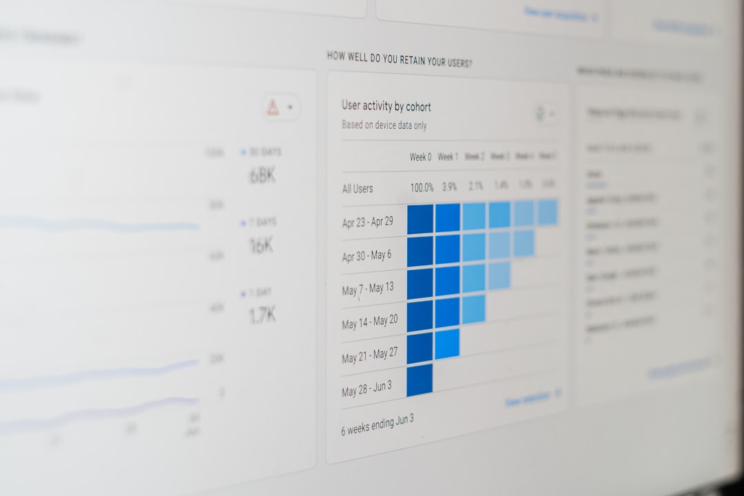
Time series charts are often presented as line charts, bar charts, or area charts. Line charts are useful for showing continuous movement, while bar charts are better for comparing discrete time periods. Analysts may also add moving averages to smooth out short-term fluctuations and reveal broader trends.
Workload Calendars and Resource Planning
Workload calendars show how work is distributed across people, machines, rooms, departments, or other resources. They are important because a schedule may appear realistic until resource capacity is considered. If three critical tasks are assigned to the same specialist during the same week, the plan may fail even if the timeline looks reasonable.
A workload calendar helps planners balance assignments and prevent overload. In a consulting firm, it can show which analysts are available for new client work. In a hospital, it can support staff scheduling. In a warehouse, it can help managers plan shifts around expected order volumes.
Good workload analysis considers both quantity and quality of time. Ten available hours are not always equal if they occur during low-energy periods, after long shifts, or while a worker is switching between unrelated tasks. For this reason, workload charts are often most useful when combined with knowledge from supervisors and team members.
Critical Path and Network-Based Time Charts
For complex projects, planners may use network-based time charting methods such as the Critical Path Method. This technique identifies the longest sequence of dependent tasks that determines the shortest possible project duration. If any task on the critical path is delayed, the entire project may be delayed.
Critical path analysis helps teams distinguish between tasks that have scheduling flexibility and tasks that do not. This distinction is essential in construction, engineering, software implementation, and large event planning. Managers can use it to prioritize attention, assign experienced staff, and monitor the most schedule-sensitive work.
Although critical path charts can be more technical than basic timelines, they provide powerful insight. They help planners understand not only when tasks occur, but why certain delays matter more than others.
Choosing the Right Time Charting Technique
No single chart works best for every planning or analysis need. The right technique depends on the purpose, audience, time horizon, and level of detail required. A simple timeline may be enough for a public presentation, while a detailed Gantt chart may be necessary for internal execution. A time series chart may be ideal for performance review, while a workload calendar may be better for staffing decisions.
Selection can be guided by these questions:
- What decision must the chart support? Planning, monitoring, forecasting, or reporting may require different formats.
- Who will read the chart? Executives, analysts, supervisors, and clients may need different levels of detail.
- How precise must the timing be? Some plans require hourly accuracy, while others use monthly or quarterly periods.
- Are dependencies important? If task relationships matter, a Gantt or critical path chart may be appropriate.
- Is the focus on activities or data? Activities fit planning charts, while measurements fit time series charts.
Best Practices for Time Charting
Effective time charting requires more than placing dates on a diagram. The chart must be accurate, understandable, and maintained. Outdated charts can create false confidence and lead to poor decisions. For this reason, teams should review important time charts regularly and update them when assumptions change.
It is also important to avoid unrealistic precision. A chart that appears exact may still be based on uncertain estimates. Planners should identify assumptions, include buffers where appropriate, and mark high-risk tasks. When uncertainty is significant, scenario-based charts can show optimistic, expected, and conservative timelines.

Useful best practices include:
- Use clear labels and consistent time intervals.
- Highlight critical dates, deadlines, and decision points.
- Use color carefully to show status, category, or priority.
- Separate high-level summaries from detailed operational charts.
- Review charts with the people responsible for the work.
- Document assumptions behind estimated durations.
- Update charts as actual progress data becomes available.
Using Time Charts for Analysis and Improvement
Time charts are not only planning documents; they are also learning tools. After a project or operational cycle ends, analysts can compare planned timelines with actual outcomes. This comparison may reveal underestimated tasks, approval delays, resource shortages, or inefficient handoffs.
For example, if several projects show repeated delays during legal review, the organization may need earlier legal involvement or more review capacity. If a time series chart shows that customer support requests peak every Monday morning, staffing can be adjusted. If workload calendars show chronic overassignment of experienced employees, training or hiring may be needed.
Through this type of analysis, time charting supports continuous improvement. The organization becomes better at estimating, scheduling, and responding to change.
Common Mistakes to Avoid
Several mistakes can reduce the usefulness of time charts. One common error is charting too much detail for the audience. A senior leader may not need hundreds of task bars. Another mistake is ignoring dependencies, which can make a plan look flexible when it is not. Teams also sometimes fail to update charts after changes occur, causing the chart to become disconnected from reality.
Another issue is treating the chart as the plan itself. A time chart is a representation of planning decisions, not a substitute for communication, judgment, or risk management. The best results occur when time charts are paired with regular review meetings, clear ownership, and reliable data.
Conclusion
Time charting techniques give structure to planning and evidence to analysis. They help people see the relationship between tasks, dates, resources, and results. From Gantt charts and milestone charts to time series analysis and workload calendars, each method offers a different view of time as a business and management resource.
When selected carefully and maintained regularly, time charts improve coordination, reduce confusion, and support better decisions. They allow organizations to plan with greater realism, monitor progress with more confidence, and learn from past performance. In a world where timing often determines success, strong time charting practices remain essential for effective planning and analysis.
FAQ
What is time charting?
Time charting is the practice of visually organizing tasks, events, resources, or data across a time scale. It helps planners and analysts understand schedules, sequences, trends, and performance patterns.
Which time chart is best for project planning?
A Gantt chart is often best for project planning because it shows task duration, start dates, end dates, progress, and dependencies. For complex projects, critical path analysis may also be useful.
How are time charts used in analysis?
Analysts use time charts to compare planned and actual performance, identify delays, detect trends, and forecast future activity. Time series charts are especially useful for studying data over regular intervals.
What is the difference between a timeline and a Gantt chart?
A timeline usually shows events or milestones in chronological order, while a Gantt chart shows tasks, durations, and often dependencies. Timelines are simpler, while Gantt charts are more detailed.
How often should time charts be updated?
Important time charts should be updated whenever major assumptions, deadlines, task statuses, or resource availability change. In active projects, weekly or even daily updates may be appropriate.
Why do time charts sometimes fail?
They often fail when they are too complex, outdated, inaccurate, or not connected to real decision-making. A useful chart must be clear, current, and supported by communication among stakeholders.