
Figma is the best all-around app icon design tool because it helps you build a clean icon, test sizes, and keep your brand style in one place. Your app icon is tiny, but it does heavy work. Google Play asks for a 512 x 512 pixel app icon, so every shape and color choice must be clear at small size [source: Google].
TLDR: Use Figma if you want control, Canva if you want speed, and Looka if you need brand ideas fast. For example, if 1,000 people see your app in search, an icon that improves taps by just 8% could mean 80 more store visits. That is not magic. That is just clearer color, better contrast, and less clutter.
Contents
Best 5 App Icon Design Tools
A great app icon should be easy to spot. It should also feel like your brand. Not “random cute square number 47.” It needs rhythm. Color. Memory.
Here are five tools that make that easier.
1. Figma
Best for: teams, startups, designers, and people who care about details.
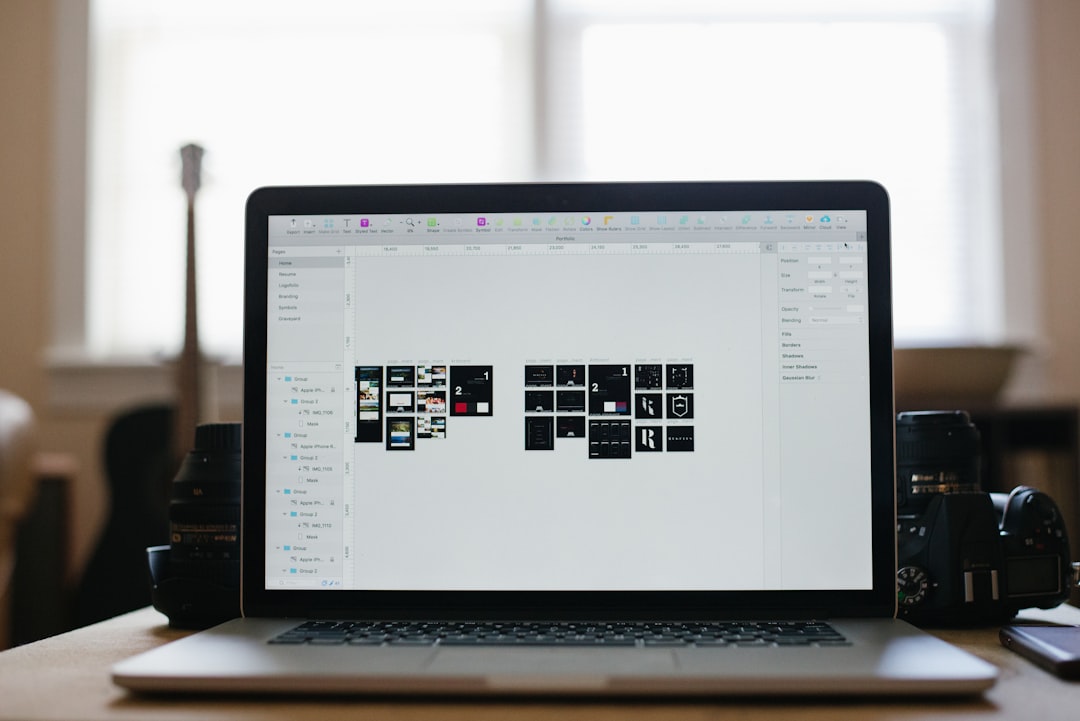
Figma is the top pick because it gives you full control. You can build icons with vectors. You can test rounded corners. You can preview the icon at tiny sizes. That matters a lot.
It also works well for brand systems. You can save colors, fonts, grids, and reusable parts. So your app icon can match your website, app screens, ads, and social posts.
Why it is great:
- Clean vector tools.
- Easy team comments.
- Great for icon sets.
- Works in the browser.
- Strong layout and grid control.
The annoying bit: Figma can feel too blank at first. You open a new file and think, “Cool. Now what?” Expect to spend a few minutes setting up frames and guides. Worth it, though.
Use Figma if your icon must look sharp, polished, and part of a bigger brand.
2. Canva
Best for: fast designs, solo founders, marketers, and non-designers.
Canva is the friendly tool in the room. It gives you templates, icons, shapes, gradients, and color sets. You can drag stuff around and get a decent first draft fast.
This is great if you need ideas today. Not next week. Not after twelve mood boards. Today.
Why it is great:
- Very easy to use.
- Lots of ready-made graphics.
- Good color palette tools.
- Quick exports.
- Great for social brand assets too.
The catch is… Canva icons can start to look familiar. That cute rocket? Other apps may use something very close. So tweak hard. Change colors. Remove extra bits. Make it yours.
Use Canva if you need a clean icon fast and do not want to fight software menus.
3. Adobe Illustrator
Best for: pro icon designers and pixel-perfect vector work.
Illustrator is a classic for a reason. It is powerful. It handles vector shapes like a champ. If your icon has custom lettering, smooth curves, or clever geometry, Illustrator can handle it.
It is also great for export control. You can create many sizes and formats. That helps when preparing icons for iOS, Android, websites, and press kits.
Why it is great:
- Top-level vector editing.
- Precise shape tools.
- Great color control.
- Strong export options.
- Works well with other Adobe apps.
Honestly, it feels like Illustrator sometimes hides simple tasks behind too many panels. Moving one tiny anchor point can become a mini workout. But if you know the tool, it is hard to beat.
Use Illustrator if you want a custom icon built like a tiny logo.

4. Looka
Best for: brand ideas, logo-based icons, and early-stage businesses.
Looka is not just for app icons. It is more of a brand idea machine. You give it a name, style, and colors. Then it creates logo concepts. Some of those can work well as app icon starters.
This is useful if you do not have a brand yet. It helps you see what your app could feel like. Friendly? Serious? Fancy? Playful?
Why it is great:
- Quick logo ideas.
- Good for brand direction.
- Simple style choices.
- Nice mockups.
- Helpful for non-designers.
The downside is control. You may get a cool idea, but still need another tool to refine it. Think of Looka as a spark. Not always the final campfire.
Use Looka if you need a brand look before you design the final app icon.
5. IconKitchen
Best for: Android app icons and quick technical exports.
IconKitchen is simple and practical. It helps create Android launcher icons without making you cry into a folder full of wrong file sizes.
You can add foreground layers, backgrounds, badges, and shadows. Then export icons that are closer to what Android needs. Android’s adaptive icons use separate foreground and background layers, which helps icons fit different device styles [source: Android Developers].
Why it is great:
- Fast Android icon exports.
- Good adaptive icon support.
- Simple controls.
- No heavy design setup.
- Useful for developers.
It is not the most glamorous tool. Nobody opens it and feels like an art wizard. But it saves time. And that counts.
Use IconKitchen when you already have an icon idea and need it packaged neatly for Android.
How to Pick the Right Tool
Pick based on your job, not hype.
- Need the best all-around tool? Choose Figma.
- Need speed? Choose Canva.
- Need pro vector control? Choose Illustrator.
- Need brand ideas? Choose Looka.
- Need Android exports? Choose IconKitchen.
Also, test your icon at small sizes. This saves pain. Your 512 pixel icon may look great. Then it shrinks on a phone screen and turns into colorful soup. Not ideal.
Simple App Icon Rules
- Use one main idea. Not five.
- Keep contrast high. Pale on pale is a snooze.
- Avoid tiny text. It will vanish.
- Use brand colors. Repetition builds memory.
- Make it readable at 48 pixels. That is the real test.

The best app icon tool is the one that helps people remember you. Figma wins for most brands. Canva wins for speed. Illustrator wins for craft. Looka helps with ideas. IconKitchen handles Android exports. Pick one, make it simple, and please remove that tiny unreadable slogan.

