
Mobbin is usually the stronger choice for serious Tinder UI screenshot research, while Pttrns works better for quick pattern hunting and older mobile inspiration. A dating app team studying swipe cards, match screens, onboarding, profile editing, and paywall prompts will likely get faster value from Mobbin because it focuses on full product flows. Pttrns still has value, but it feels lighter, narrower, and sometimes dated when the goal is modern dating app design.
TLDR: Mobbin is best when a designer needs structured screenshots and full user flows for dating app inspiration. Pttrns is useful for scanning mobile UI patterns, but it may require more manual digging. For example, a product designer comparing 10 swipe based onboarding flows might finish the first review in Mobbin in about 20 minutes, while Pttrns could take 35 to 45 minutes because context and flow depth are thinner. For Tinder style design work, Mobbin wins on depth; Pttrns wins on simplicity.
Contents
Why Tinder UI Screenshots Matter for Dating App Design
Tinder shaped how many users understand dating apps. The swipe card, quick match feedback, simple profile preview, and low friction chat entry became familiar patterns. A new dating app does not need to copy Tinder, and it should not. Still, studying Tinder style screenshots helps teams understand what users already expect.
Designers often look for inspiration around:
- Swipe interactions for liking, passing, and rewinding profiles.
- Match moments that create excitement without feeling cheap.
- Profile layouts that balance photos, prompts, interests, and trust signals.
- Subscription prompts for boosts, unlimited likes, and premium filters.
- Safety features such as reporting, blocking, and verification badges.
The biggest challenge is not finding screenshots. It is finding screens that still reflect current product thinking. Dating apps change often. A screenshot from three years ago may show different monetization, different safety standards, or different visual habits.
Mobbin for Tinder Style Inspiration
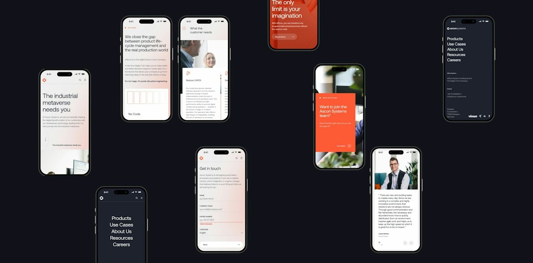
Mobbin is built for product designers who want to study real app screens with context. Its biggest strength is flow based browsing. Instead of seeing one isolated screen, a designer can often follow a sequence. That matters for dating apps because the experience is not one screen. It is a string of small decisions.
A designer can study how an app introduces location permissions, asks for photos, explains premium features, and moves a user into discovery. That sequence shows intent. It reveals where the app builds trust and where it asks for commitment.
Mobbin is especially useful for dating app teams working on:
- Onboarding audits before launch.
- Competitive research across dating, social, and lifestyle apps.
- Monetization design for trials, upgrades, and paywalls.
- UX writing for empty states, permissions, and match feedback.
- Design system references for buttons, cards, sheets, and tab bars.
The catch is that Mobbin can feel gated. Some of the good material sits behind paid access, and that can be annoying during an early research sprint. A designer may find the perfect flow, click through, and hit a plan limit. It breaks momentum. Still, for teams with a budget, the time saved can justify the cost.
Pttrns for Dating App UI Ideas
Pttrns has long been known as a mobile UI pattern gallery. It is useful when a designer wants to scan many interface examples quickly. Categories such as onboarding, profiles, activity feeds, forms, and settings can help spark ideas.
For Tinder inspired design, Pttrns works best when the task is broad. A designer might search for card layouts, profile headers, tab navigation, or empty states. The tool is less ideal when the goal is to understand an entire dating journey from signup to first message.
Honestly, it feels like Pttrns sometimes asks the designer to do too much detective work. A screen may look useful, but the surrounding context is thin. The designer has to infer what came before and what comes next. That adds friction, especially when the team is trying to make product decisions fast.
Pttrns is still helpful for:
- Fast visual scanning during early moodboard work.
- Pattern comparison across several mobile apps.
- Simple UI references for forms, lists, filters, and cards.
- Idea generation before wireframing begins.
Mobbin vs Pttrns: Key Differences
| Factor | Mobbin | Pttrns |
|---|---|---|
| Best use | Full product flow research | Quick pattern browsing |
| Dating app value | Strong for onboarding, subscriptions, safety, and matching flows | Good for visual ideas and common mobile layouts |
| Context | Usually stronger | Often limited |
| Speed | Fast once the right app or flow is found | Fast for browsing, slower for decision making |
| Cost concern | More likely to require paid access | Often simpler for casual research |
Which One Should a Dating App Team Use?
A startup designing a Tinder alternative should start with Mobbin if the team needs product logic. This includes signup flow, profile setup, match celebration, reporting, messaging, and premium upgrade screens. These areas are tied to user trust and revenue, so shallow inspiration is risky.
Pttrns is better during the early visual phase. It can help a designer collect ideas for card shape, spacing, icon placement, and screen structure. It is also useful when stakeholders need a quick view of common mobile patterns without a long research report.
A practical workflow could look like this:
- Start with Mobbin to study complete flows from dating, social, and community apps.
- Use Pttrns to gather extra visual references for specific layouts.
- Map the findings into themes such as trust, speed, fun, safety, and monetization.
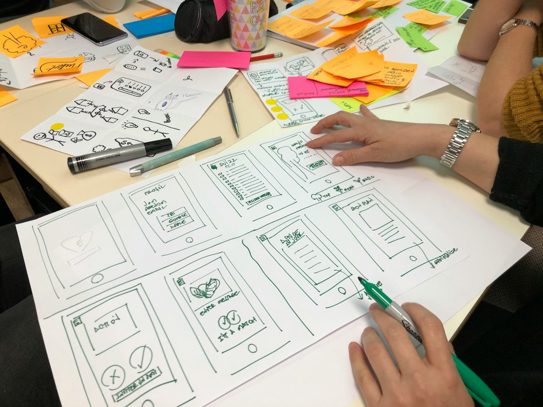
- Create original wireframes instead of copying screens directly.
- Test with users to see whether swipe, match, and chat flows feel clear.
What to Watch Out For
Designers should avoid treating Tinder screenshots as a ready made blueprint. Tinder has brand power, years of user behavior data, and a specific business model. A new dating app may serve a niche audience, such as serious relationships, queer communities, single parents, or local events. Those users may need different cues.
Copying the swipe pattern can also create problems. Some users find endless swiping tiring. Others want more profile depth before making a choice. If a team copies only the surface, the app may feel familiar but empty.
The smarter approach is to study screenshots for principles. For example, Tinder keeps actions simple and visible. It reduces typing early. It makes the match moment feel immediate. Those ideas can be adapted, but the final design should fit the product’s own audience.
Final Verdict
Mobbin is the better research tool for serious Tinder UI screenshot analysis. It gives designers more context, better flow visibility, and stronger material for product decisions. Pttrns remains useful as a lighter inspiration source, especially for quick mobile pattern checks.
For a dating app team, the best answer is not one tool forever. Mobbin should guide the core UX research. Pttrns can support the visual exploration. Used together, they help designers move faster without blindly copying Tinder.
FAQ
Is Mobbin better than Pttrns for Tinder UI screenshots?
Yes, in most serious design research cases. Mobbin is better for full flows and product context. Pttrns is better for quick visual scanning.
Can designers find actual Tinder screens on these platforms?
Availability can change. Designers may find Tinder related screens, older captures, or similar dating app examples. They should also compare apps like Bumble, Hinge, Badoo, and Feeld for broader insight.
Should a dating app copy Tinder’s UI?
No. Tinder can inspire patterns, but direct copying weakens brand identity and may create legal or ethical issues. The better move is to study the logic behind the screens.
Which tool is better for paywall and subscription design?
Mobbin is usually stronger because it often shows fuller upgrade flows. This helps teams see how premium features are introduced and sold.
Is Pttrns still worth using?
Yes. Pttrns is useful for quick layout ideas, mobile UI categories, and early visual research. It works best as a support tool, not the only research source.

